

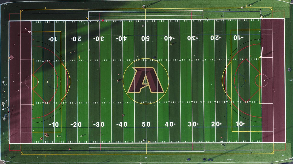
While the mascot is staying the same, due to difficulties in placing the logo on the turf fields, the Algonquin Titan logo was recently changed to a more symmetrical, dynamic redesign that incorporates more of Algonquin’s anchor school color, maroon.
Discussions of changing the logo started last summer when members of the Athletic Complex Project Committee began planning the lining and labeling of the stadium and multipurpose fields. It soon became clear that the current Algonquin “A” was asymmetrical, making it difficult to place on the field.
“The plan was to put our logo on the center of the stadium field, which is not unusual, but what we found was that our current Algonquin ‘A’ was hard to place in a way that made it look right,” Principal Sean Bevan said. “When deciding whether to split the ‘A’ down the middle with the flange [the part of the cross of the A that projects to the left] included or without the flange included, both of them looked a little bit off. It looked like the flange creeped out toward the outer circle of the center field and then when you slid it over a little bit, it looked even stranger. There was just no good way to do it. It ended up generating interest in revisiting the logo itself.”
In hopes of finding a solution, the committee reached out to a graphic design professional in the community, who prefers to remain anonymous. At the Feb. 28 Northboro-Southboro Regional School Committee meeting, this individual was identified as a person employed by the Boston Celtics.
“[This individual] suggested that maybe we revisit our logo and not only make it more symmetrical, but also more dynamic,” Bevan said. “They took a crack at reshaping it, and the evolved new logo really reflects a lot of what the current logo looks like but is an updated form of it. We will be using that logo for the center of the stadium field and then in all the other places that logos exist.”
At the same Regional School Committee meeting, superintendent Gregory Martineau shared that the cost for the redesign was $4000.
“I think it’s important to note that what we paid for was some graphic design but also the creation of a branding guide that is useful and that would standardize the fonts, the colors, so that we don’t have 15 different teams with 15 different variations of fonts and colors on uniforms,” Martineau said during the meeting. “I think it will serve the community well in the future… and we had the opportunity to work with a graphic designer who does work for the Celtics so what [we] received is professional level, high-quality work.”
In addition to the project committee, some students were involved in providing feedback on the new logo.
“We asked [Business teacher Jonathan] Cahill, as part of his marketing classes, to get some feedback from his students as we’re looking at finalizing the logo package,” Bevan said. “We are getting a little bit of student voice in before we make the final adjustments.”
While a few students were asked to provide feedback after the redesign was complete, many believe that the last logo design process had more transparency and community participation than this one.
“I think it’s because most of these conversations [about a new logo] happened at the very end of the school year and through the summer and in an effort to get the athletic complex completed really quickly and make these decisions quickly, we just didn’t have access to students,” Bevan said. “I think it’s a process that happened pretty quickly and, as a result, didn’t give us an opportunity to reach out to kids. Generally though, I always really like to get kids’ feedback on all kinds of things.”
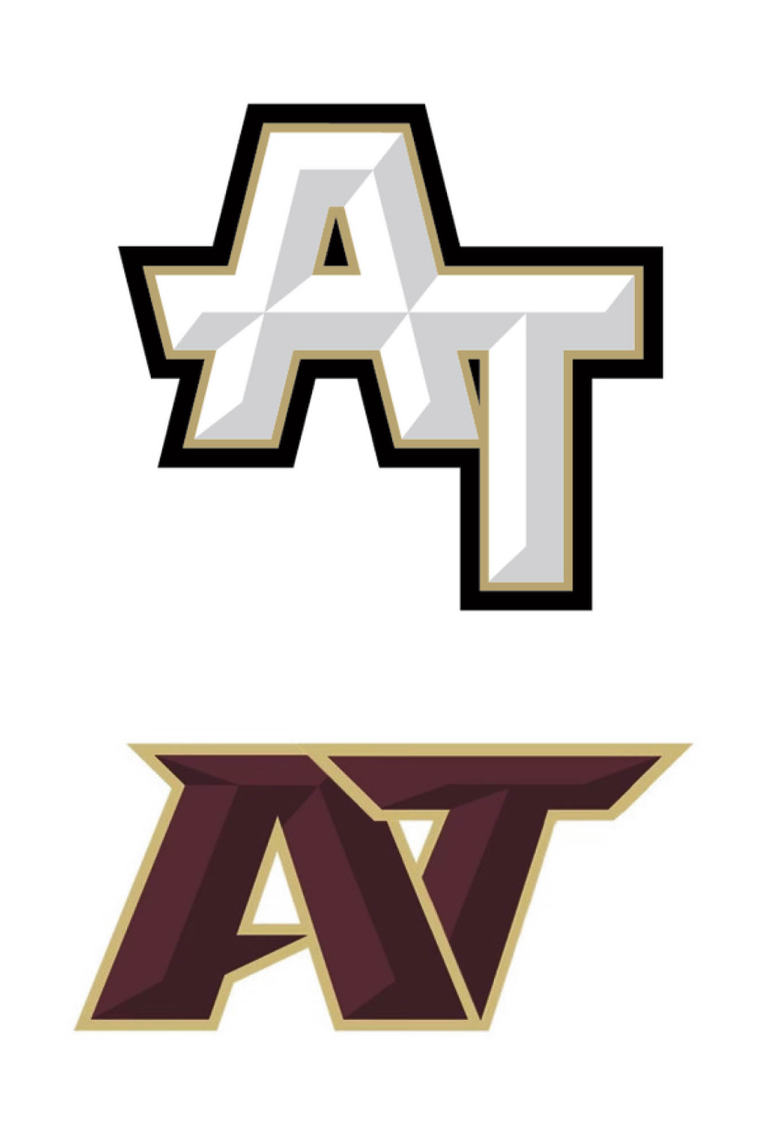
While included in the new logo package is a new “A” and “AT” design, according to Bevan the primary logo used will be the singular “A”.
“With our old logo, I would say it was a 50-50 between using the white ‘A’ and the ‘AT’ but with this new logo, 99.9% of the time the logo used will be the singular ‘A’,” Bevan said.
Athletic Director Mike Mocerino believes that the new “A” design is one that the school community will appreciate and proudly showcase across the school.
“Our objective through the rebranding effort was to facilitate the transition away from our former [Tomahawk] mascot, which has now been retired, and towards embracing an evolving, symmetrical, school resemblance ‘A’ logo,” Mocerino said via email. “Over many years there have been numerous iterations of our school ‘A’ as it has been fashioned and depicted in various fonts and styles and I believe this new design will catalyze a complete shift towards a dynamic, universally embraced logo.”
The new logo package took a long time to finalize, with many varying factors, including a focus on the official school colors.
“It wasn’t until very recently did we really complete the whole package that would include a new version of the ‘A’ and a version of the ‘AT’ interlocking logo,” Bevan said. “The updated logo really focuses more on our school color which is maroon and the previous logo had a lot of white in it which isn’t our school color. We are really shifting back to a greater emphasis on maroon and on a dynamic logo.”
Mocerino is happy with the outcome of the redesign.
“I fully support our new ‘A’ logo and am thrilled to contribute to its introduction across the entire school community,” Mocerino said.
There have been mixed student reactions to the new logo.
“I don’t really like the new logo; I think the points of the ‘A’ feel really hostile,” senior Mackenzie Clark said. “It just doesn’t feel as welcoming. The new logo is flat, sharp and pointy and I feel like it is yelling at me.”
Others see the new logo as an improvement.
“I like the new one better because I don’t like that there was so much white and gray in our [old] logo,” junior Alex Shaw said. “I feel like keeping it maroon and gold is good. I don’t really see much of a design difference other than the colors.”
Senior Ryan Daloisio also prefers the new logo.
“I like the new one better; the old one is boring,” Daloisio said. “I feel like the new logo is an innovative design and is an improvement from the blocky, super white old logo.”
According to Bevan, uniforms are replaced on a cycle of five to six years, and ARHS received a $50,000 grant to replace the old uniforms with the Tomahawk mascot. The majority of the $50,000 has already been spent on logos with the existing “A” and “AT” logo.
“Many of our uniforms are updated already with our current logo package, but beginning about a month ago, we started to place orders with the new logo on them,” Bevan said. “This will start to be added to any new uniform orders, which will include softball, rugby and baseball.”
Bevan is proud of how the new logo turned out.
“I think this new logo is the superior logo,” Bevan said. “It’s more dynamic. The old logo was blocky and steady looking, which had its own appeal but I think the new logo communicates a sense of motion that I feel is more exciting looking.”
Mocerino appreciates the redesign and believes a strong school logo is important.
“A well-designed logo can become a symbol of our school’s identity, promoting a sense of pride and belonging among our students, staff, alumni and the wider community,” Mocerino said. “A good, aesthetic logo can help our school stand out, is easily recognizable and can be used across various communication channels, including our websites, social media pages and uniforms.”
Mocerino believes the new logo will have a lasting, positive impact.
“Overall, while a logo might seem like a small aspect of our rebranding process, it can be very impactful on our school culture and image of Algonquin,” Mocerino said.